
Sketching from photo inspo

Last month we looked at reference photos: abstracting them, taking them, and finding them. Today I wanted to show you how the photos I used as examples have made their way into my representational sketchbook practice. These sketches are one of my favorite ways to consider the world and slow my mind down to the pace of my drawing hand.
Selection
choosing which parts to include and how to arrange them on the page.
A reference photo is full of ideas and starting points – it is not an answer key for how your sketch should turn out.
Photos usually include a lot more information than we will use in a painting. It can be helpful to remember that when making your art you can take out, add in, and rearrange the elements as much as you'd like.
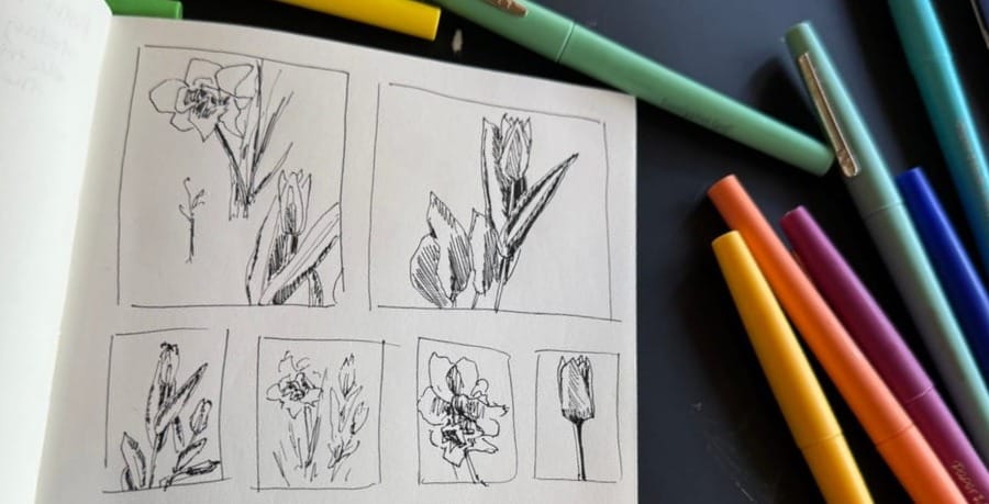
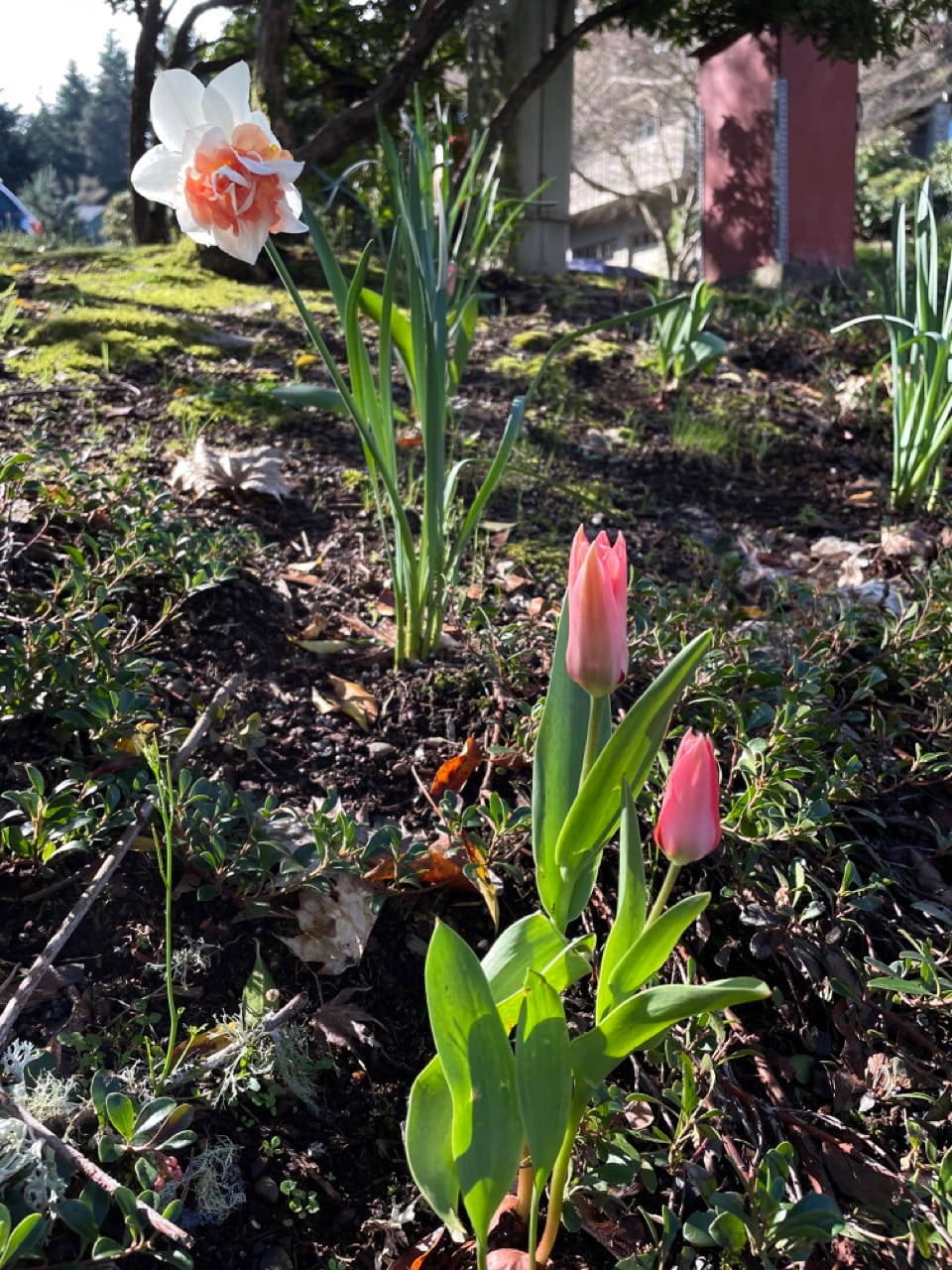
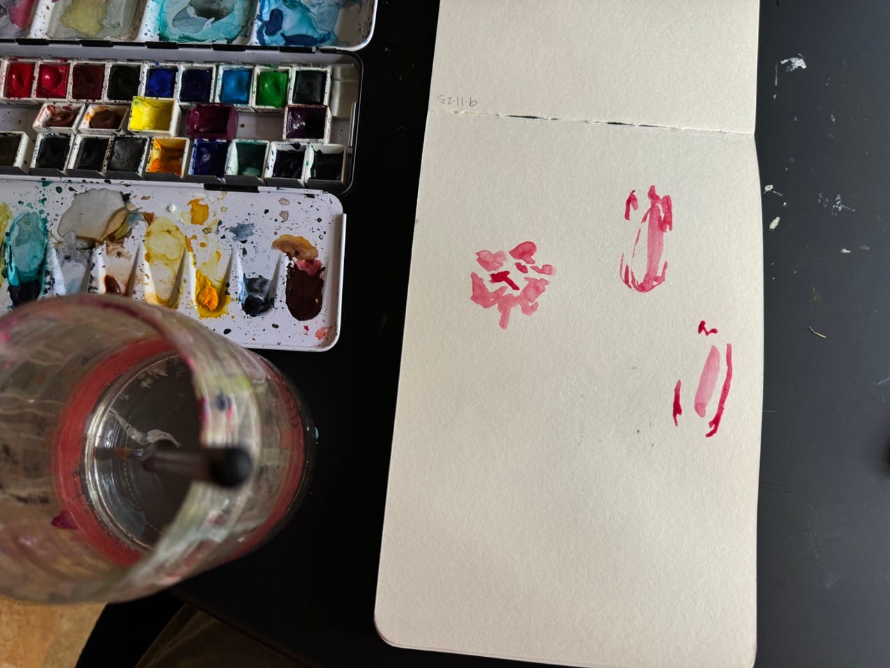
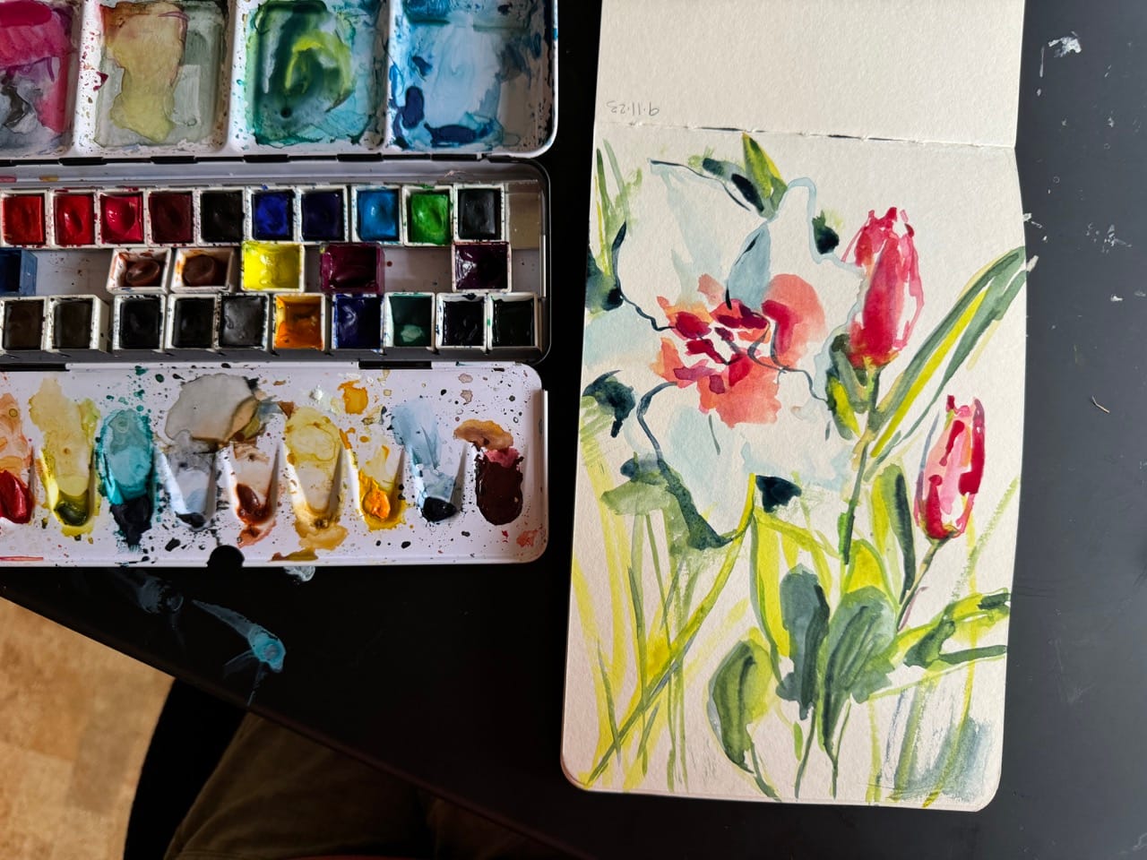
For this photo I made thumbnail sketch boxes and tried out different ideas. I tried focusing on each flower, or smaller parts of them. I tried putting them next to each other, and keeping them in the diagonal arrangement they have in the photo.
After making these quick drawings I took a minute to look at them and see which ones sparked interest for me. I liked the two on the bottom left – the tulips alone, and the two flowers repositioned so they are next to each other. I made some color marker sketches based on those ones.
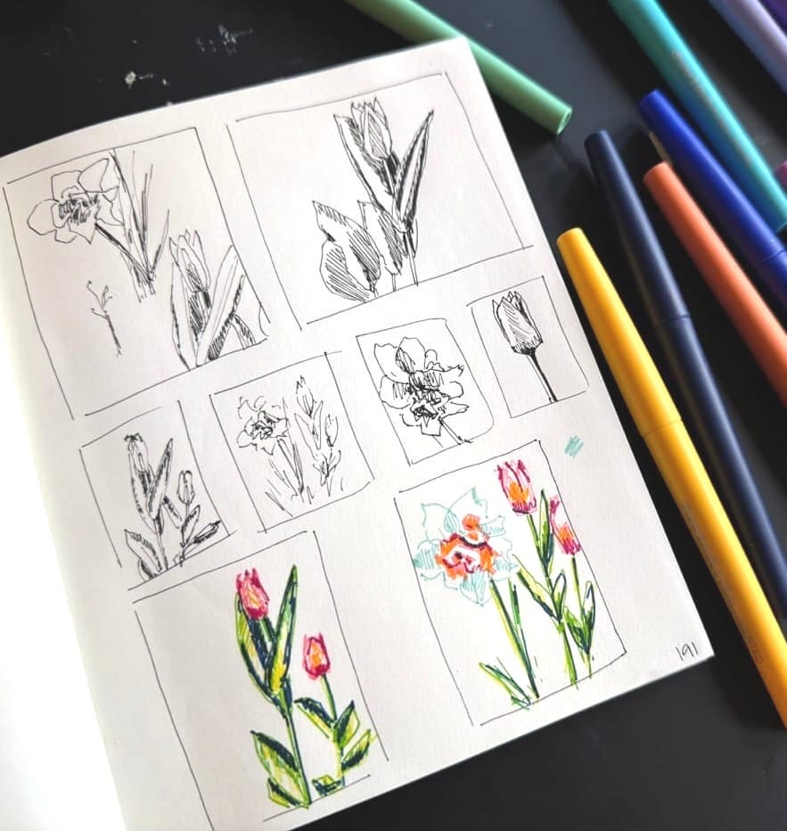
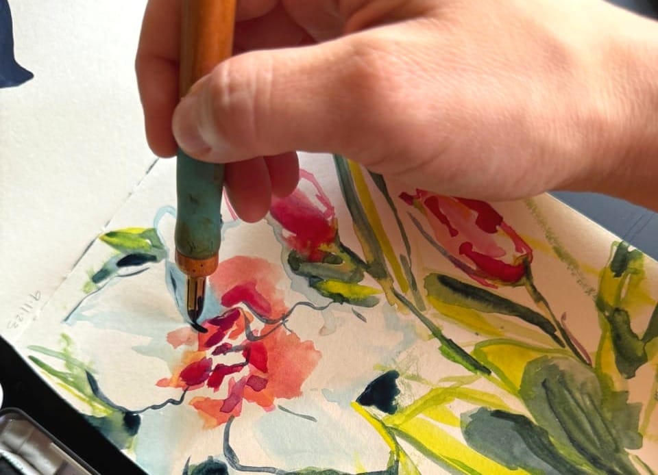
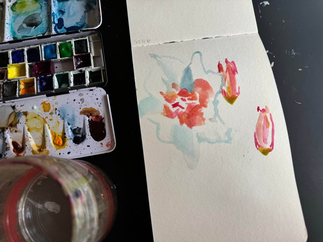
Then I went with the one with both flowers for my final sketch because I liked the fullness. I started in with pink. Using the same paint for all the pink parts will help to draw the piece together, even if I differentiate them with other colors in additional layers.
I added in some light blues and greens to fill out the rest of the flowers, along with some yellows and magentas to add nuance to the pink.
I used the green to lay out more of the green fill. These first ones are based on the reference photo. I saw how the greens added a lot to even out the composition and decided to keep adding it in until I reached the fullness I had in mind.
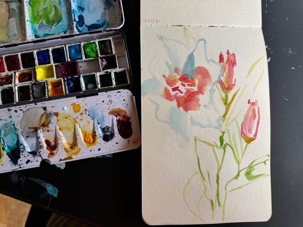
To preserve the bright green parts of the leafs and stems, I painted in large sections with a cool yellow, planning to go over them and create shadow edges once this layer dried.
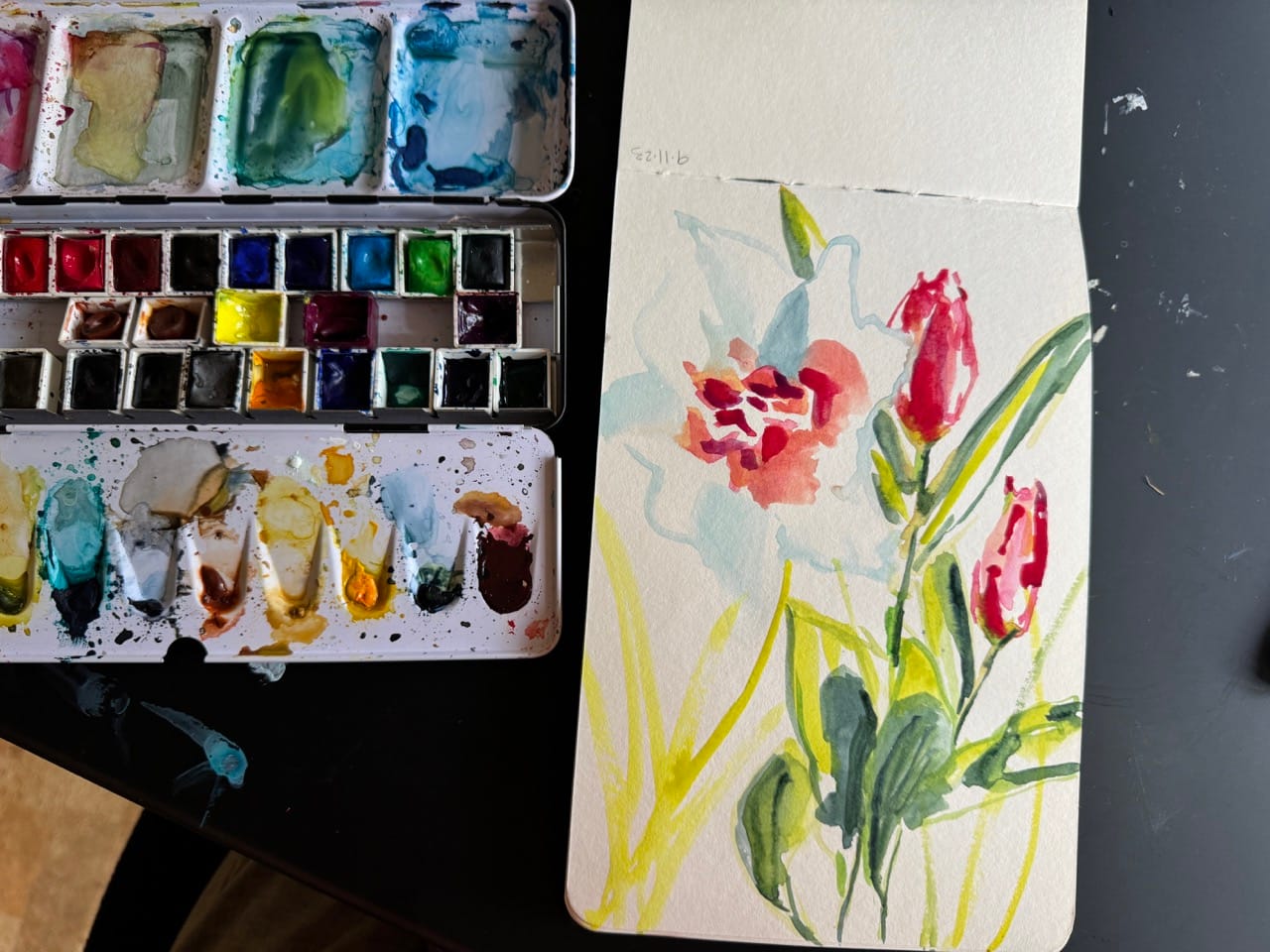
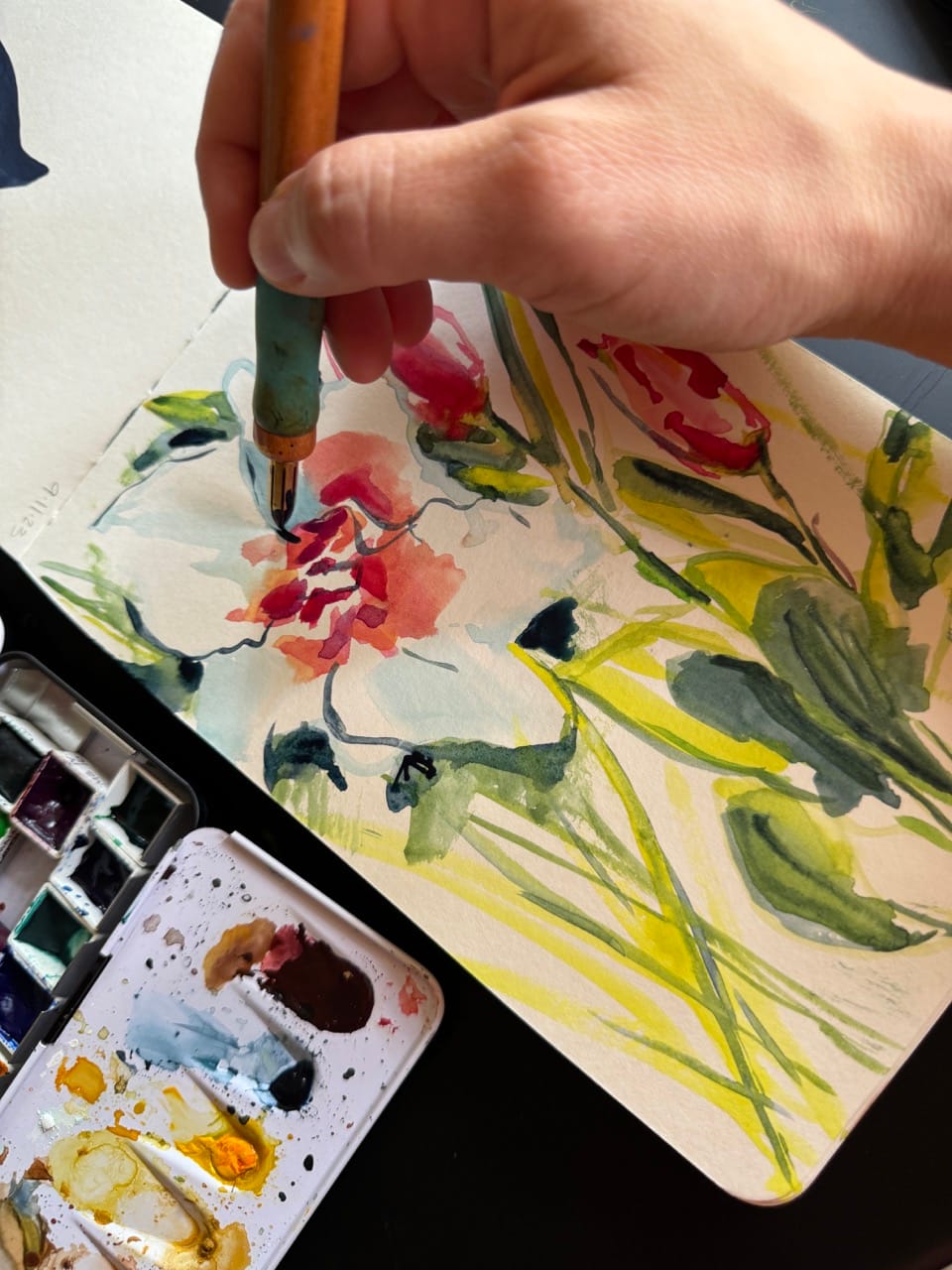
To make the white flower look white I knew I needed some contrast around it. I punched in some deep blue/greens at key points. I love this part – how the light blue suddenly transforms into shadow on white petals!
To add even more of that delicious contrast, I got out my dip pen and added more dark bits in a deep blue ink.
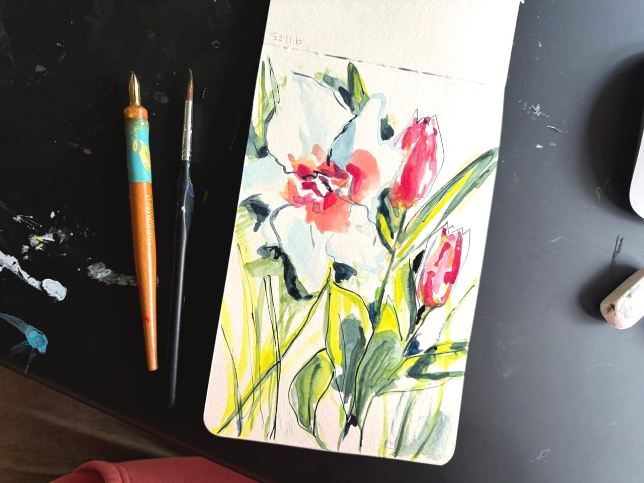
This was a 15 minute sketch according to the timestamps on my photos - so it's a quick one, and a satisfying burst of this year's spring blooms.
Selfie
It's June! So I'm painting birthday selfies. (2022, 2022, 2023)
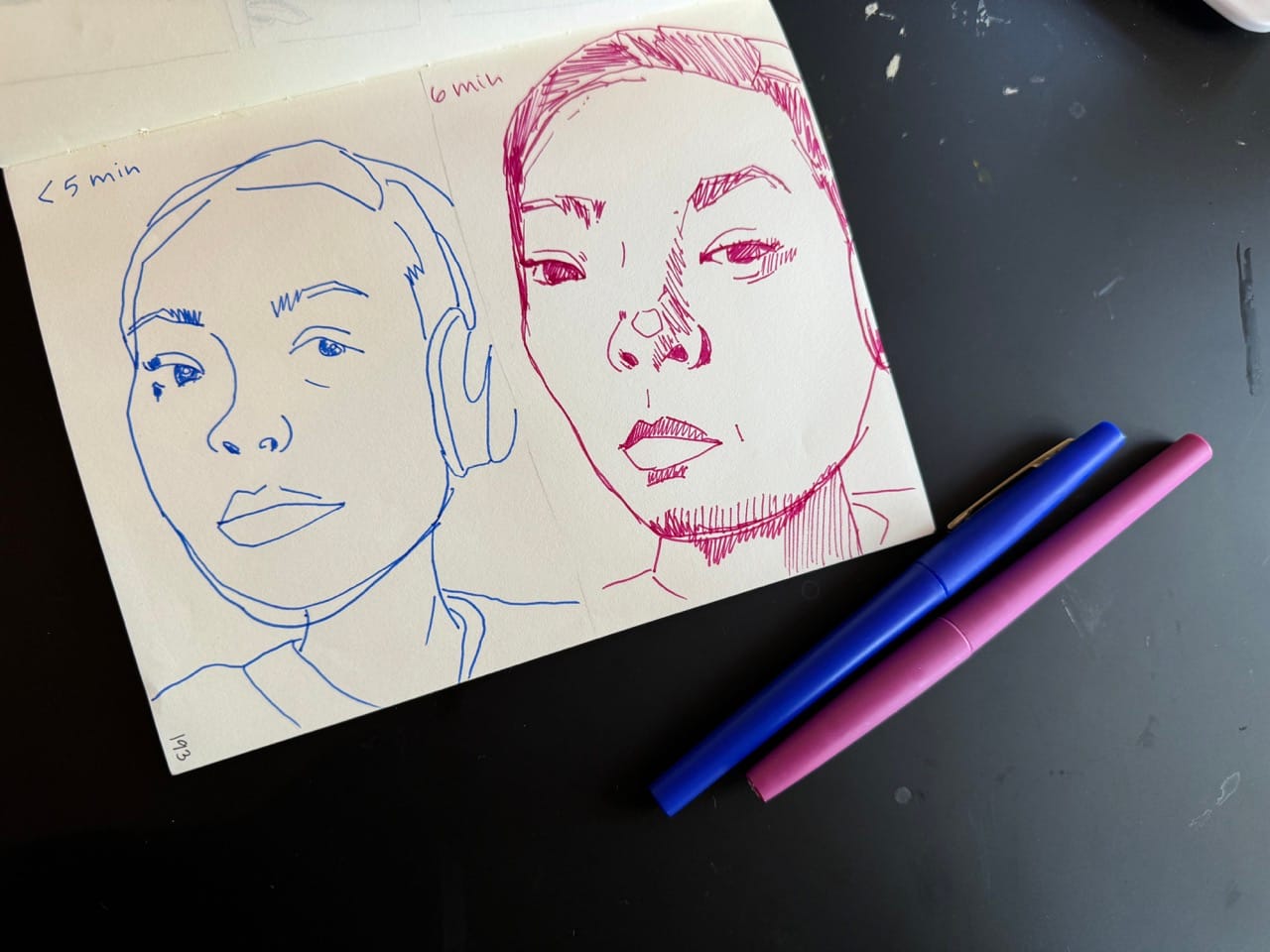
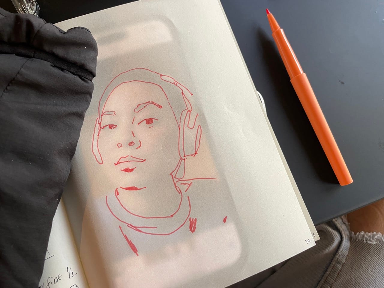
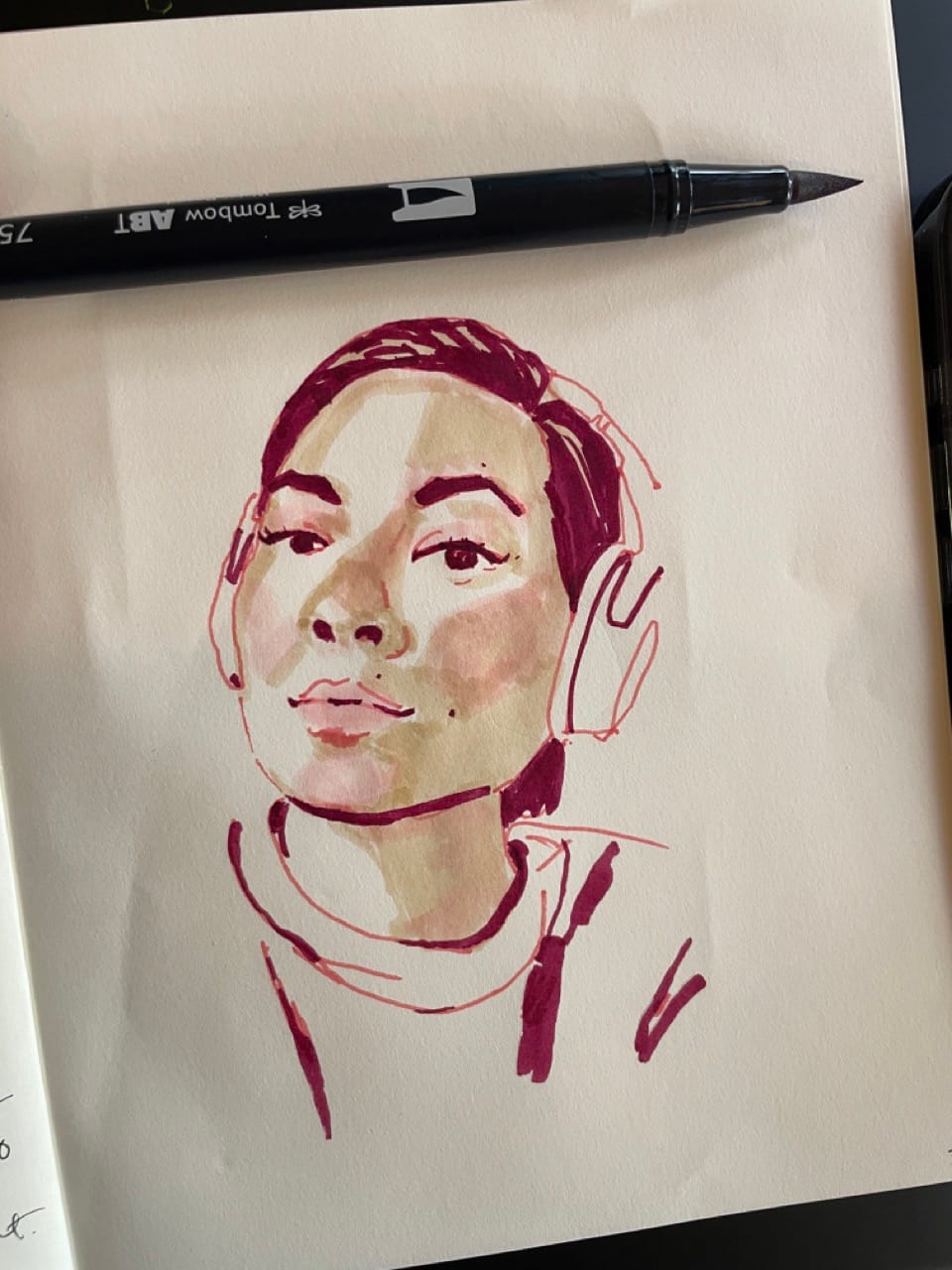
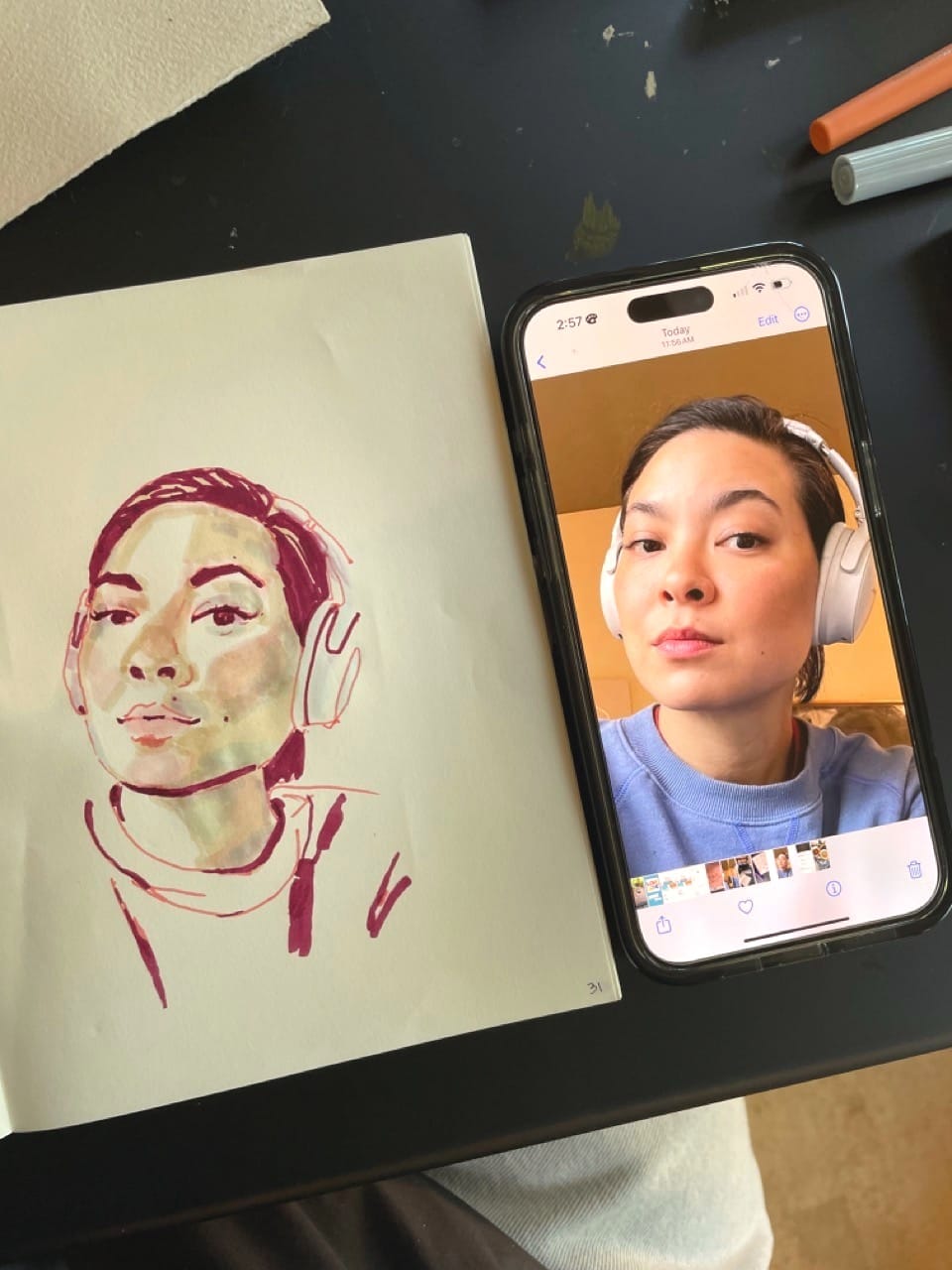
I thought I'd go with a photo of myself with headphones on that I shared last time. I started out with two quick contour drawings. They weren't quite blind, but they weren't careful – I focused much more on the photo than on the sketch, and drew the outside edges of things, leaning into exaggeration and loose marks.
I made this on a day when I felt short on time, and decided that I would trace some landmarks instead of spending more time drawing the accurate proportions. I also wanted to show you this simple way of image transfer. To do it, turn your phone brightness up and place it under your paper. My touchscreen is still sensitive through a layer of this paper, so I am careful to not touch the screen and move the photo (notice how my left hand is working through my sleeve). I don't trace everything - just a few marks are all I need to know where stuff goes.
I am still breaking in some of the very light value markers I bought this spring. Most markers that come in sets are all too dark to get these kinds of effects – I bought these ones individually at an art store. When I tested them there they seemed so light that they were almost invisible. But once I got them home and used them in a setting like this they were quite rich!
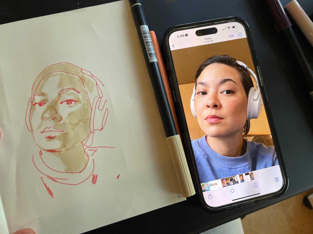
I was intending to just block in the shadow shapes, but I messed up a bit on the nose and added in shadow on the left side where there isn't any. I used to feel more of a compulsion to scrunch my paper up and start over, but now I know: just finish the sketch. I am almost always glad I did. Plus, I knew that at this point, even if it was destined to turn out with a funny nose, that I had not yet learned everything I could from this sketch, and that's the checkpoint I make sure to hit on every page.
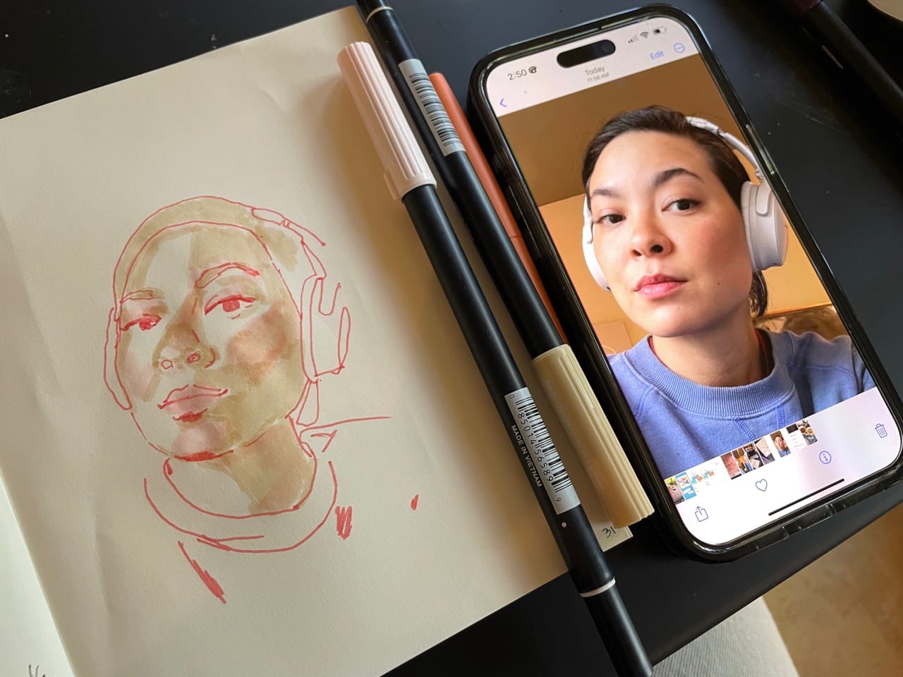
I then went in with a very pale pink marker to warm up those cheeks and chin.
Then it's the fun part: adding in the darks. I'm always raving about this, I know, but it just feels so good. Suddenly everything is put into perspective. Even the extra nose shadows – they don't look as strong now that they aren't the darkest thing on the page.
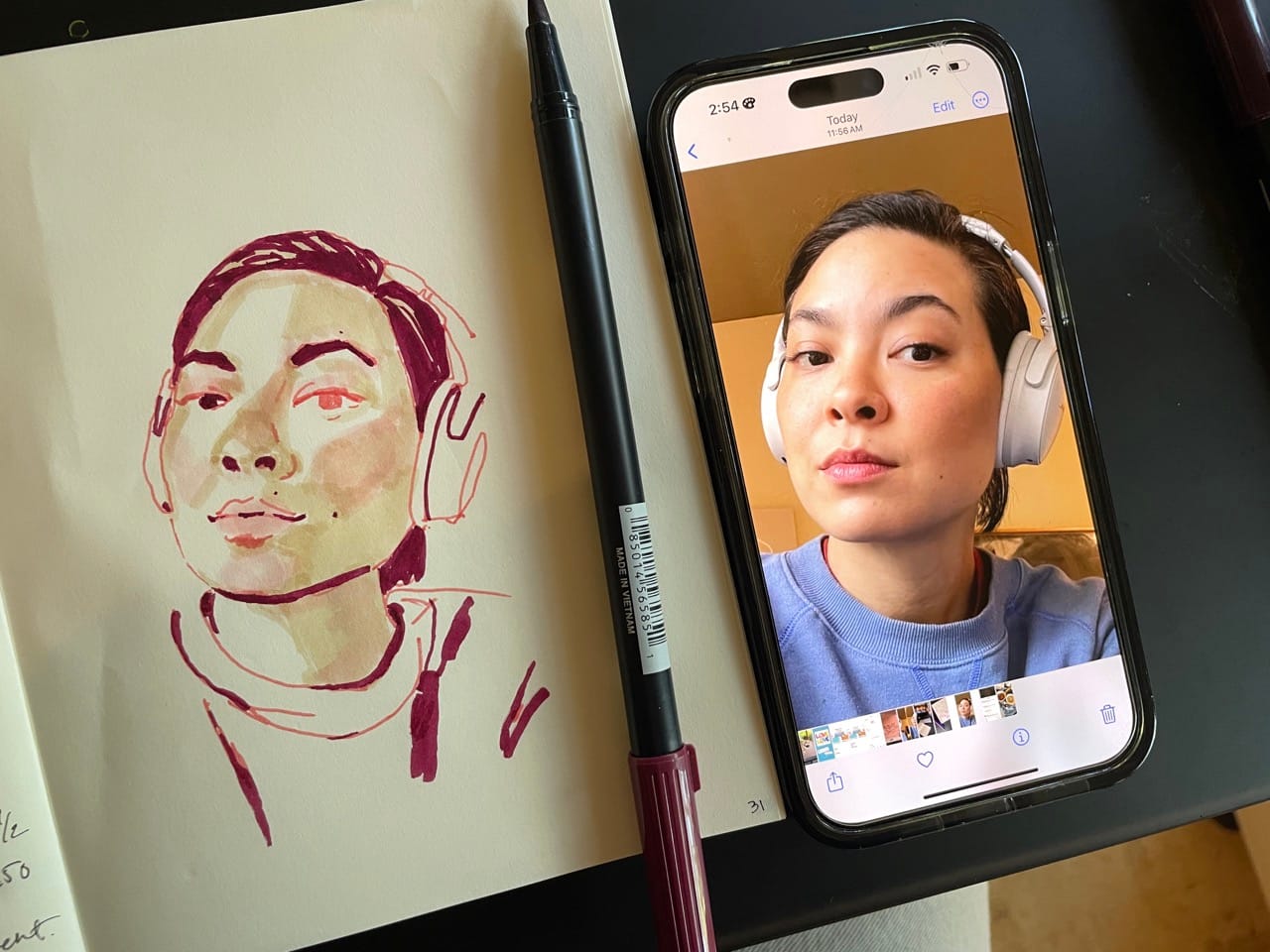
A few details go a long way: I filled in the eyes, but left a tiny glint of light pink in one; I put in three of my freckles (and left out a few hundred); 8 little hits of eye lashes are already an exaggeration; three small dashes do the trick for the shadow between the lips.
I went in with a light gray marker to deepen a few more shadows and called it good.
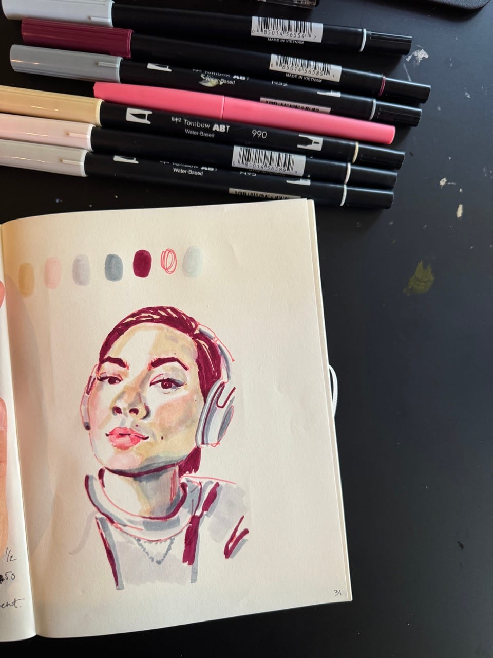
Here's the final sketch with the markers I used. Aside from the two light ones, they aren't obviously skin or portrait colors, but as always, the thing that matters most is the relationship between the colors: that the light parts are light and the dark are dark, that the lips are warmer than the shadows, that kind of thing. It's ok to trust the view's eye to translate the rest.
Not precious
random ideas, difficult supplies
Painting a good idea often clams me up. I'm working on a piece right now that means something to me personally and I've redone it at least 6 times, and spent hours between just staring at it. But you know what does not freeze me up? Painting a throw away idea on throw away paper. I'm still trying to use up my sketchbooks and this black one is particularly burdensome. It's difficult that it's black, and the spinal binding is so big it gets in the way of my hand, and the paper has weird texture. A few times I've considered just setting it aside for good – life is too short for painting on paper you hate right? But then I come back. Part of me wants not just to finish it, but to learn something, to figure out how to make it work.
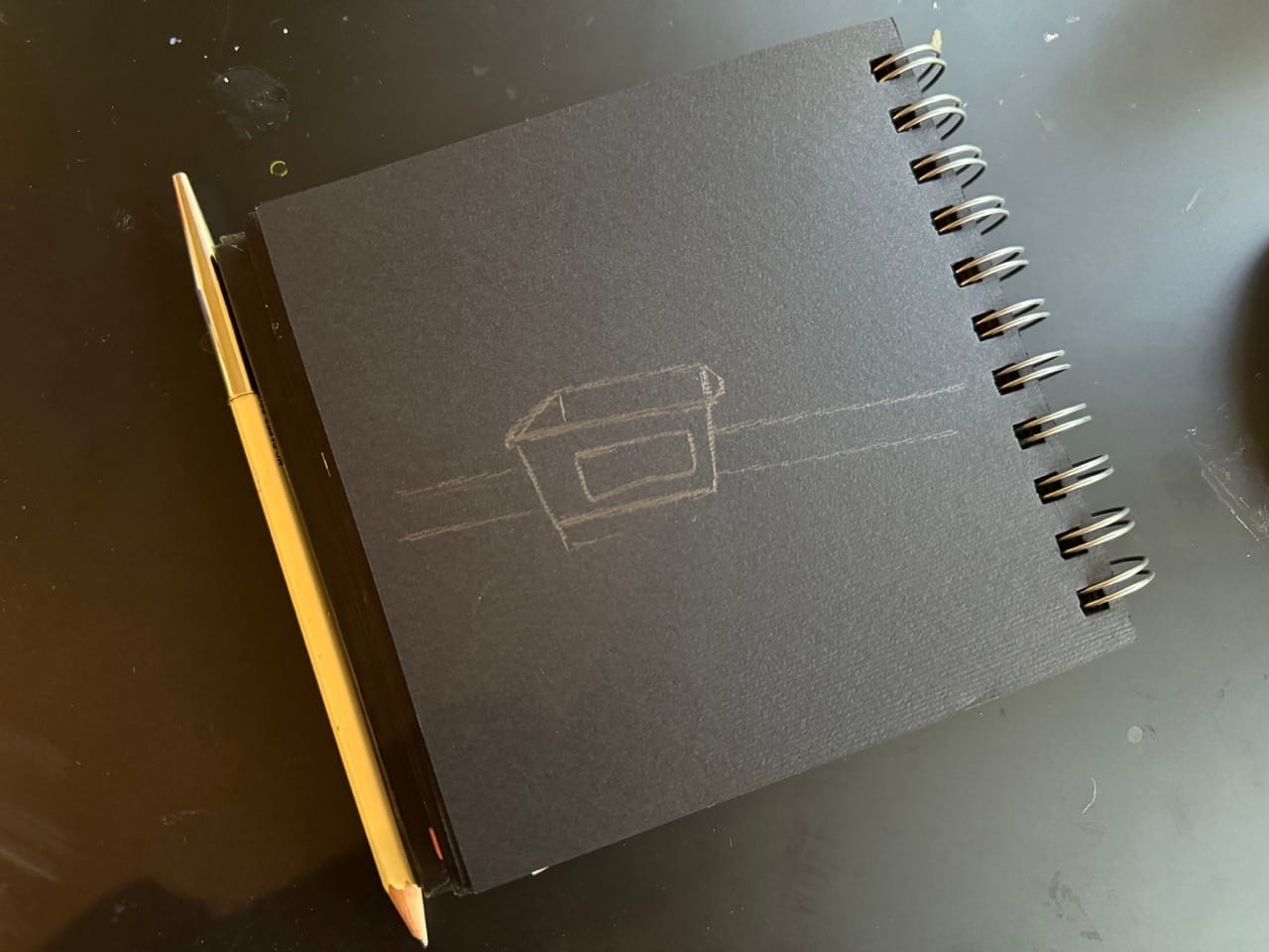
So I turned the page and started in painting my neighbor's glass recycling bin.