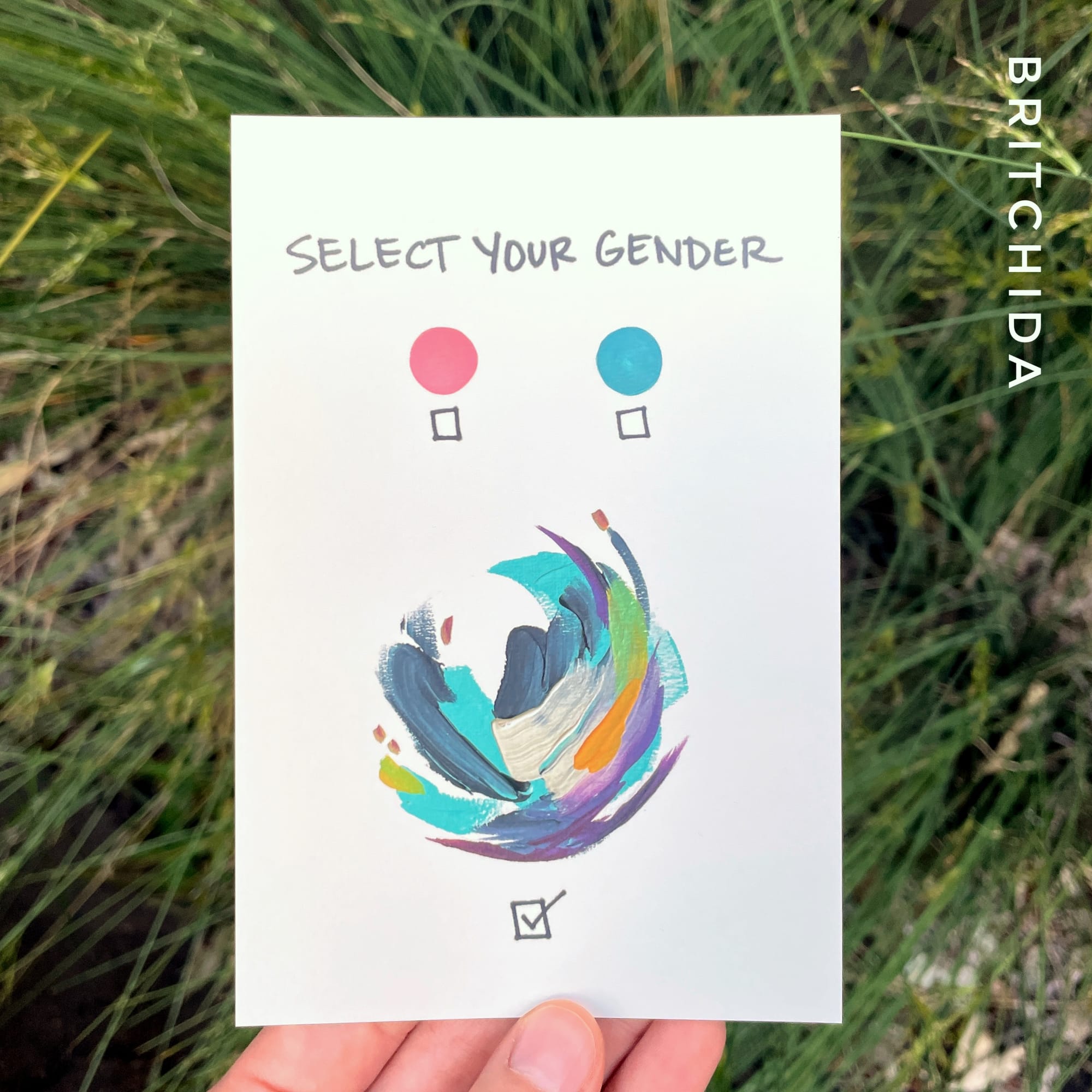
Using Color, pt 3: Brit's Abstract Diagrams

I wanted to show you specifically how I apply these concepts of limited palettes, blending and mixing in my open-ended abstract diagram series. I thought it might be interesting to run through some of the pieces I've made over the years and take note of color considerations that went into it.
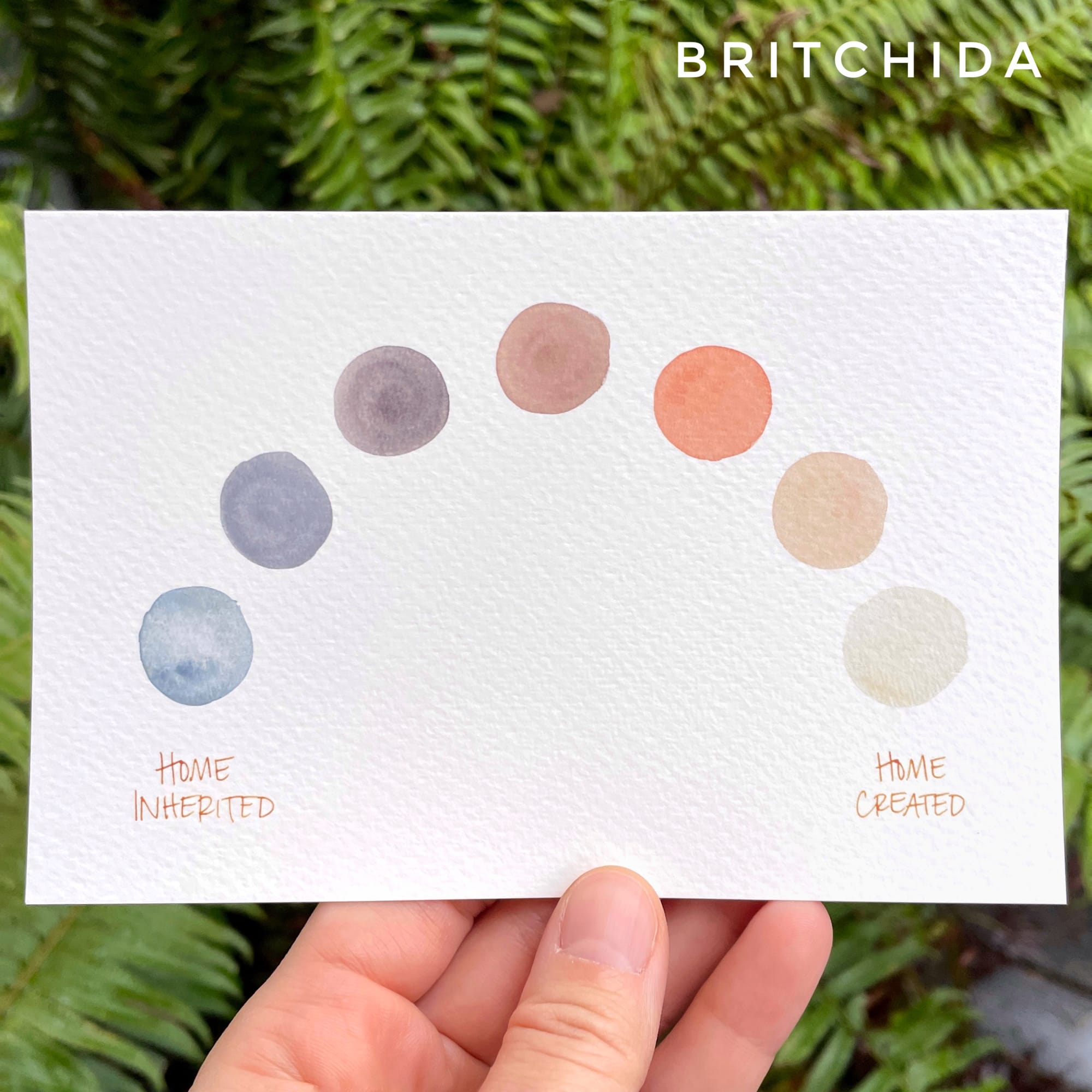
Home Created
This piece employs mixing without blending. I used a triad of paints (a light blue, titan buff (the almost-white of the last circle) and an orangey-red) to make these mixes. I tested them out on scratch paper until I had seven shades that felt gradual and connected before painting them out. I could have made a blended arch, but I felt that making distinct shapes could still portray a gradient while also invoking other imagery, like a sun rising and setting or moon phases, which hints at the passage of time. It was important to me that this piece imply that there was plenty of time between the beginning (home inherited) and the ending (home created). Also, using distinct colors infers a series of changes, whereas a blended gradient might seem more like a gradual change that just happened without distinct choices.
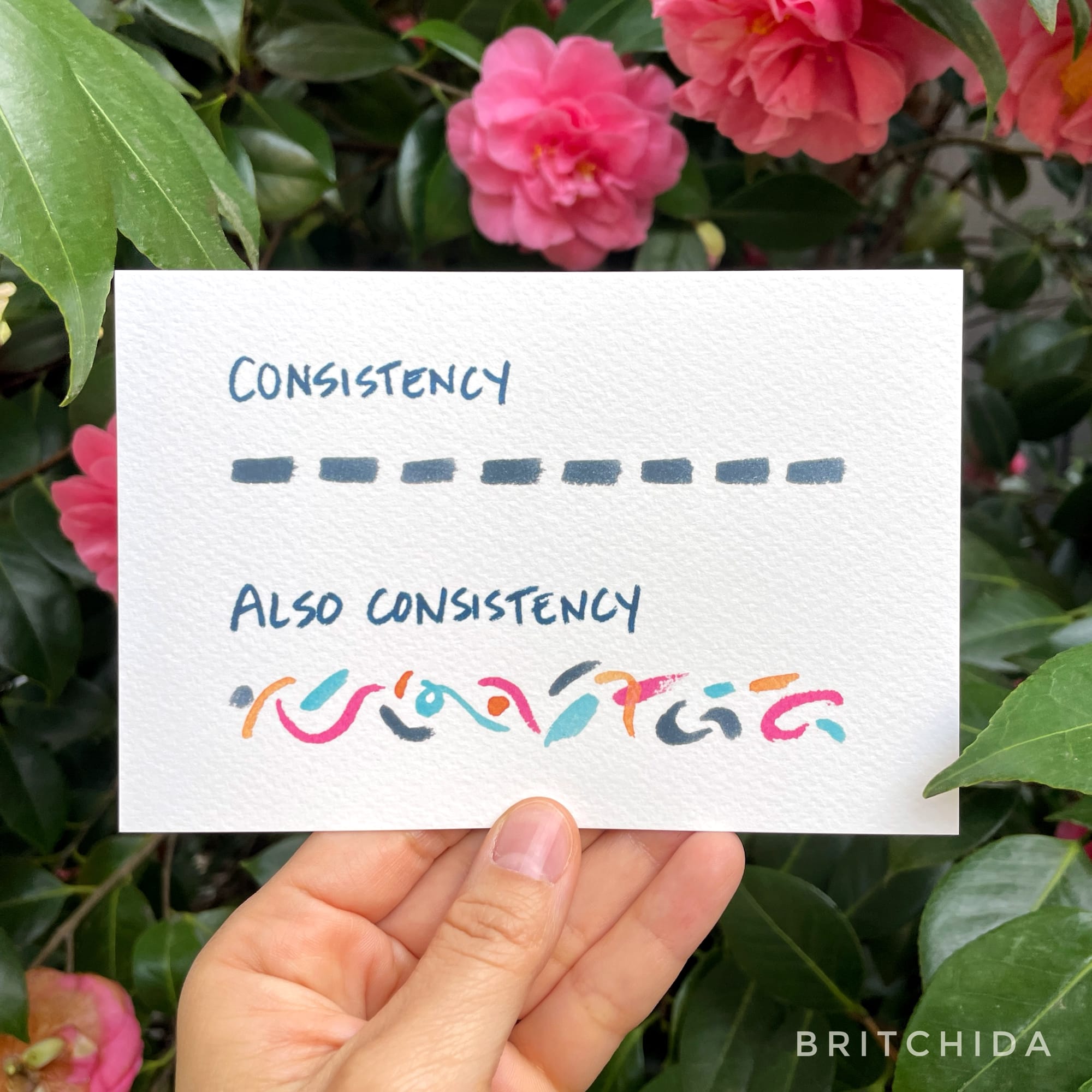
Consistency
I wanted the colorful, irregular marks to mimic the black marks above – many distinct efforts. If I had let them blend together, while it would have added more emphasis to the sense of chaos, it would have detracted from the parallel between the two. By mixing my colors but not letting them blend I let the color, shape and rhythm be the differences between the two, which conveyed my message most clearly.